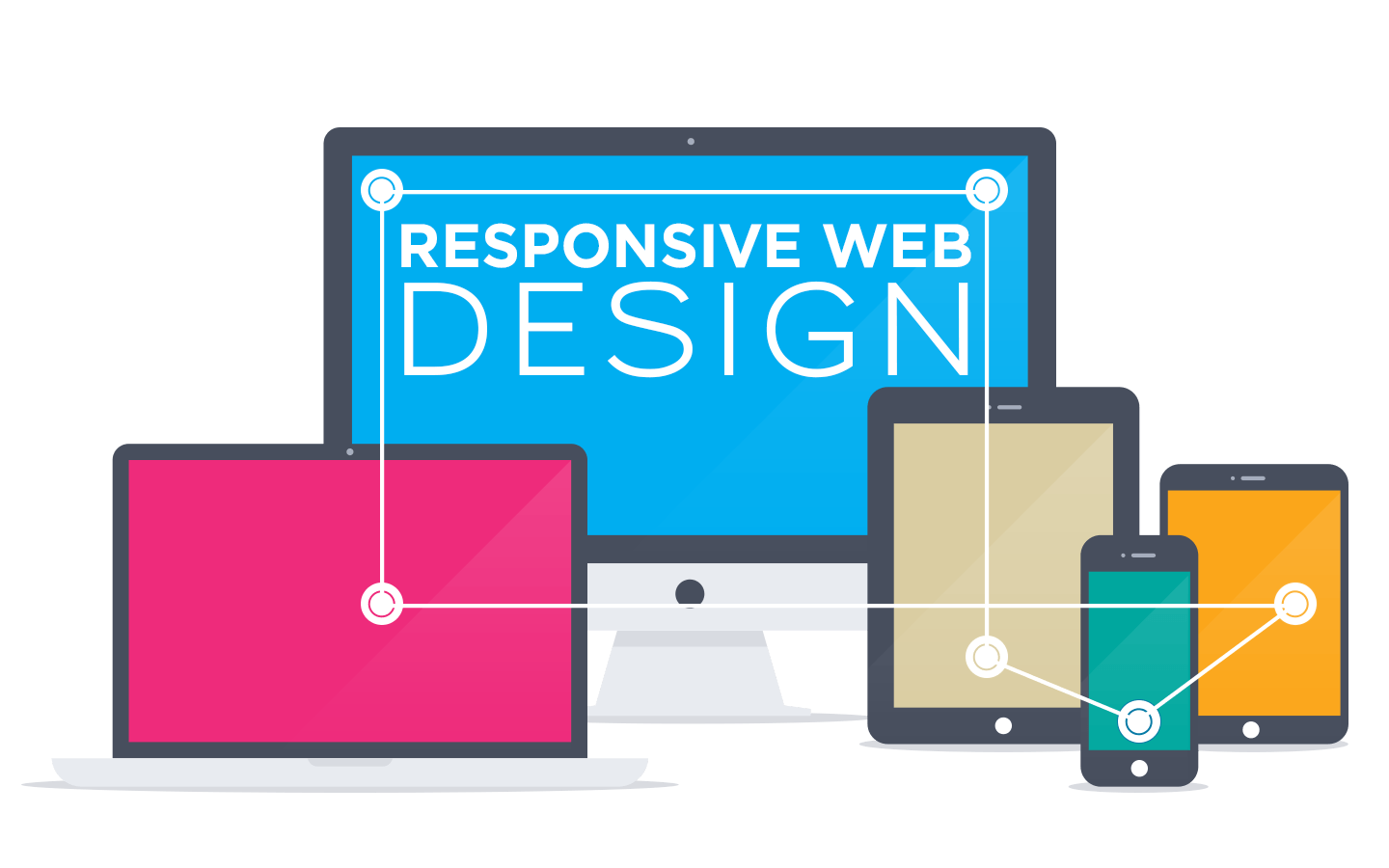
It is safe to say that on-demand access to information is a part of our life, whether it is through computers, cell phones, or the ever-expanding range of linked screens and devices. Mobile is the epitome of connectivity, and as a result, the way people interact with online material has undergone a seismic paradigm shift in the twenty-first century.
You can get the best user experience by hiring experts from the best Software Development Company In Chandigarh. They will help you develop websites for different platforms: mobile and desktop.
In this article, we will show you the difference between web and mobile design.
Difference Between Web and Mobile Design
-
Large Screens
A bigger screen can display more substantial content and information, allowing for simultaneous viewing and improving the clarity of both text and graphics. On a handheld device, we anticipate some degree of content quality reduction. Content placement also undergoes a considerable adjustment.
Large screens also become awkward for users who are constantly moving.
When there is too much content, users must scroll all the way to the bottom of mobile device screens. Modern mobile browsers, however, give users the option to swiftly zoom in and out and use variable font sizes to make the content more readable.
-
Placing Content Strategically
It is different to place logically and strategically relevant content on desktop and mobile devices. In other words, developing for both mediums requires a sound information architecture. Adaptive spacing and multi-column layouts are supported on desktop devices, enabling features like a left- or right-sided navigation menu, sidebars for widgets and advertisements, and room for card structures.
You must prioritize content based on the importance of its utilization while creating a mobile user site. When designing a website for mobile, keep important information at the front of the page, avoid using a lot of content, and choose a typeface that is simple to read.
-
Quick Menu Navigations
On some websites and apps, desktop users have access to a global header that facilitates speedy navigation. Due to the limited amount of screen space on mobile devices, these functions must be accessed using other, more inventive methods.
In a mobile UI, many apps employ a side or hamburger menu to access various built-in functions. On mobile devices, it is challenging to display numerous categories and subcategories in a manner similar to desktop screens. Text links may affect precision, numerous clicks or taps, and screen real estate.
To accommodate as many selections as feasible, single-menu designs for mobile include expansion and contraction elements in addition to large text or buttons and vertical alignment.
-
Various Gestures
Users of mobile devices can employ a variety of hand gestures, including pinching, swiping, and tapping repeatedly. To improve the mobile user experience, you can employ motions like swiping left and right to switch between photographs in a gallery. For users who don’t like moving the mouse, adding gesture support to your mobile website is a terrific idea. On a desktop, a user will use a keyboard and mouse to click on the highlighted things. While creating experiences for both platforms, it is important to take these interactional distinctions into account.
-
Navigation
In addition to being smaller than desktop screens, mobile screens are also angled differently. While most mobile users see content in portrait orientation, the majority of desktop computers have a landscape orientation. It has effects on a few design decisions, with navigation being the most significant.
Vertical navigation is preferable to horizontal navigation on mobile sites. While it’s true that horizontal navigation is preferred for desktops since it allows users to concentrate more easily on the site’s content, vertical navigation is considerably simpler to utilize on mobile.
Despite the fact that desktop versions of the sites were more likely to employ horizontal navigation, 90% of mobile sites in this examination of navigation styles used vertical navigation.
-
Different Browser and App Experience
Depending on whether you want to utilize a mobile or desktop for an app or surfing, designers may vary. Just 14% of smartphone users’ online time is spent using web browsers; the majority (almost 86%) is spent on apps. Desktops are completely opposite.
When accessing websites within apps, desktop browser functions like bookmarking, printing, or opening links in new windows are not available (on mobile devices).
If adequate information architecture is not taken into account and applied, viewing websites via mobile apps results in information being jammed in smaller spaces.
On desktops, the processor speed and available bandwidth support reduce the amount of time it takes for apps and web pages to load. Mobile browsers are slower to react, and pages with a lot of JavaScript might load very slowly. Slideshows, interactive forms, and other web content benefit from a straightforward page layout that is optimized for mobile browsers and uses minimal HTML and CSS.
Wrapping Up
These distinctions must be taken into consideration while creating any mobile website. You can create an outstanding user experience for both your website and application by taking the aforementioned factors into account when developing your strategy.
What are some strategies you can use for your design projects to benefit from the differences between mobile and desktop?
Which do you prefer to design for, desktop or mobile? Inform us.
The creative design team at the Best Software Development Company In Chandigarh can assist you in improving the user experience of your present business applications on both desktop and mobile devices if you’re not satisfied with them. Contact right away.


